Role: Researcher/Designer
Research Team: Rawnson Ivanoff, Faduma Ali, Jasmine Hoskins, Lengiso Hussein
Methods: Heuristic Analysis, Remote Usability Testing Sessions, Affinity Diagramming, Wireframes & Prototyping
Design Tools: Axure, Trello, Excel, Google Docs
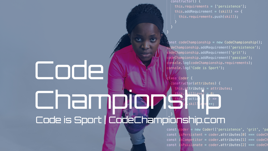
Client: Code Championship
Target Audience: Parents of children in (3rd-9th) grades, Children in (3rd-9th) grade, Educators, Women
Project Overview
By: Lengiso Hussein
This website was designed to depict coding in an extracurricular activity setting with a unique sport based theme. The site’s objective was to depict to their audience that Code Championship could be an enjoyable and family friendly experience based on their content’s delivery method.
Design Process
Heuristic Analysis
First order of business was to look over Code Championship’s Website while taking notes on any Heuristic violations present.
Examples:
Text Size
Typos in text
Consistency issues
Visibility Issues
View Heuristic Analysis PDF here
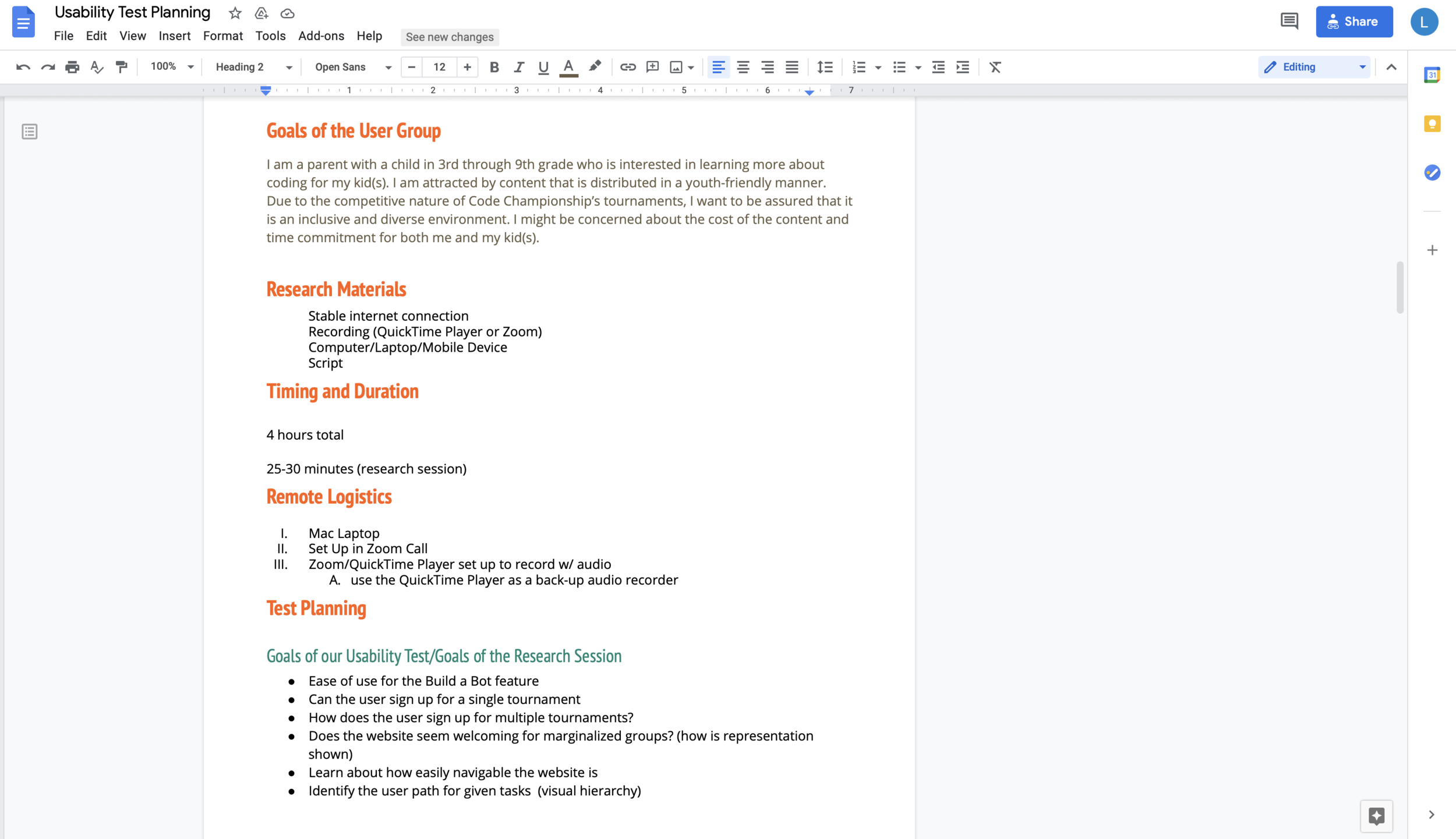
Usability Test Script
In order to test the site against our tasks, a Test script was created. In our test script certain tasks were selected that addressed our client’s intended site goals.
Selected Tasks
Task 1: Signing up for one time tournament
Task 2: Build-a-Bot game
Task 3: Creating a tournament as an Educator
View Usability Test Script here
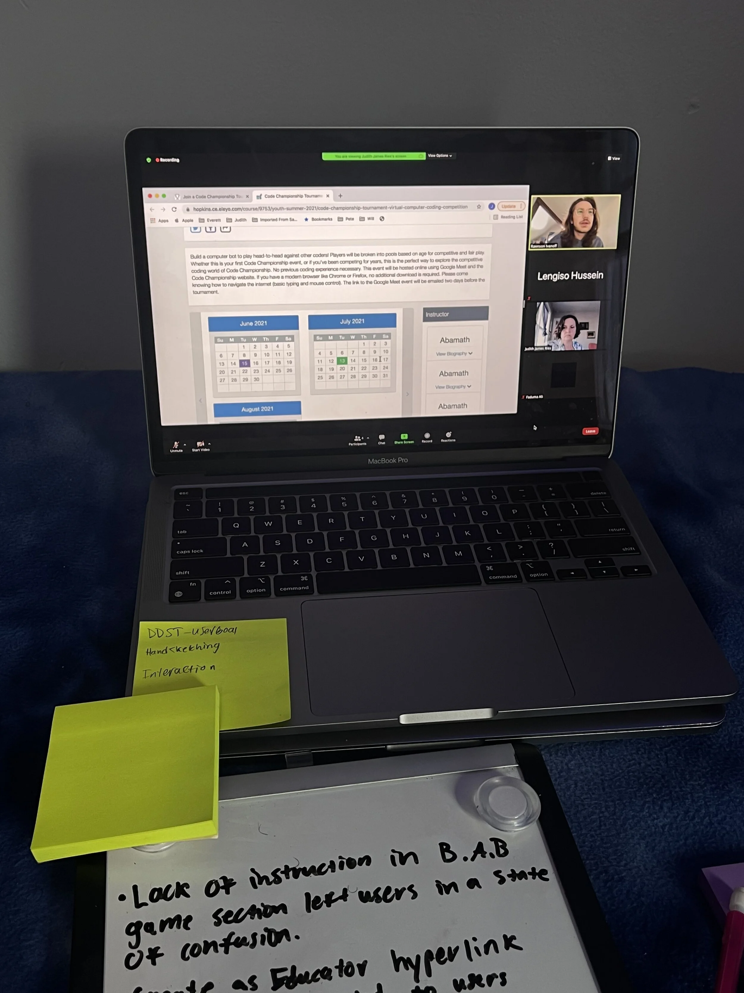
Screenshot of Moderated Remote Usability Testing Session
Moderated Remote Usability Testing Sessions
All 5 sessions were conducted in a 1-1 setting
3/5 of the participants were parents with children in (3rd-9th) grade
With 1 team member moderating the session, the remainder of the team had various responsibilities such as note taking or technological support.
Affinity Diagramming & Synthesis of Notes
Trello was a tool used to take notes and also create our affinity diagram
Once notes were gathered together under similar themes, key findings became more evident
Common themes would also be recognized as key findings
Screenshot of Affinity Diagram
Digitized Prototyping
In order to start prototyping, the findings were finalized then recommendations were made up based on these findings.
Prototype Recommendations
Make buttons seem like buttons
Modify to add clear instructions to various parts of the site
Add clear and concise messages for intended audience
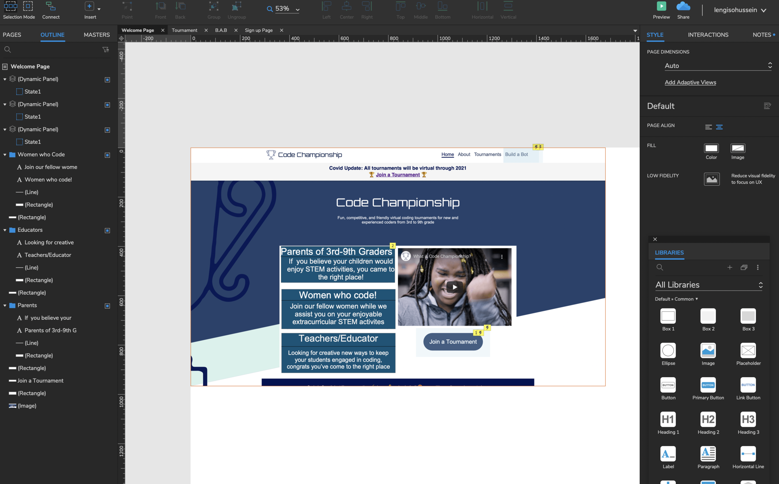
In Axure, the buttons were modified to feature a mouseover style effect in order to ensure it wouldn’t be mistaken for anything but an interactive button.
Also added sections that spoke directly to the target audience
Also added headlined instructions for signup pages
View Axure Prototype here
Next Steps
The next steps would be to go further into the B.A.B (Build-a-Bot) portion of the website and add clear and concise instructions in order to ensure users understand how to start and play the game. For the entry level in the game there are many unnecessary pieces available, which should be removed. If the user isn’t going to use those pieces for the first level then it should not even be an option to select from.
Another suggestion would be to add instructions as to what specific pieces do and how they correlate to the users game piece ie the bunny. After conducting another research session on the improved prototype, did users still feel like the buttons were not interactive buttons? Did users see any keywords that captured their attention in regards to the targeted audience. This would enable researchers to observe any differences with how users interact with the updated site.
Key Findings
Buttons did not suggest they were interactive buttons.
After hovering over certain buttons and observing no changes this left users in a state of confusion
“So I’d go to this button right here, although it doesn't change when i scroll over it so it doesn’t look like a button.” - Quote from Participant
Website doesn’t adequately speak to target audience
About half of the participants stated that the website did not make it clear who the website’s intended audience was
“I’m assuming that it’s for kids but I don’t see you know, something that says this is for youth programming so i’m not positive.” - Quote from participant
Overwhelming amounts of information
Amount of information in the B.A.B portion led to users feeling puzzled
Users are given too many unnecessary block pieces in Level 0 portion
“A lot to look at right away, I don’t really know where I’m supposed to start.” - Quote from participant
Recommendations
Altering Buttons in order to provide visual affordance
Using more commonly established visual affordances to indicate buttons are actually buttons
Use more widely established button layout practices
Include expected hover interactions
Adding specific prompts to attract Target Audience
Address the targeted audience in a straightforward manner
Suggest adding a section that will attract the target audience
Offer special sectors that encourages there target group to participate in the site
Reduce Irrelevant information pertaining to B.a.b Game
Display only the appropriate amount of information for set levels
Suggest displaying only relevant pieces for each game level
View Findings & Recommendations Report here


